The log-normal distribution is a continuous probability distribution of a positive real random variable, whose logarithm is normally distributed. It is often used to model right-skewed (long right tail), none-negative data.
A Log-normal distribution is defined by the location and scale
 that coincide with the mean and standard deviation of the log-transformed normal distribution. As they are on logged units of the original data, they are difficult to interpret. The location and scale derived from the log-normal distribution do not coincide with the mean and standard deviation of original data (unlogged) from the log-normal distribution.
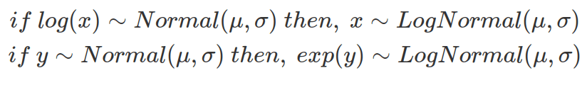
If a variable, x, is log-normal distributed, then  is normal distributed. Similarly, if y is normally distributed, then
  is log-normal distributed. These relationships do not depend on the base. If a base, a, applies, so it can be replaced by another base, b (or indeed e).
Based on the above equations, randomly sampled variables from a log-normal distribution, using and , assemble the same distribution derived from exponentially transformed variables sampled from a normal distribution, using the same and , as shown below.
############################
## LogNormal distribution ##
############################
mu=10
sd=1
N=1000000

# sln are samples following log-normal distribution, meaning these numbers, after being logged, follows normal distribution
#   sln~logNormal(mu,sd), so log(sln)~Normal(mu,sd)
# esn are exponentialed samples from normal distribution
#   esn~exp(Normal(mu,sd)), so log(esn)~Normal(mu,sd), therefore, esn~logNormal(mu,sd)
#   so esn follows the same distribution as sln
sln=rlnorm(N,meanlog=mu,sdlog=sd)
esn=exp(rnorm(N,mean=mu,sd=sd))

data2plot=bind_rows(tibble(sample=sln,type="log-normal"),
                    tibble(sample=esn,type="exponentialed normal"))

ggplot(data2plot,aes(sample))+
  geom_histogram(aes(y=after_stat(density)),bins=50)+
  facet_wrap(~type)+
  xlim(c(0,300000))
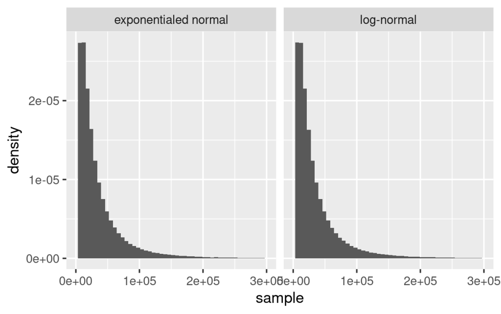
The following plot explores the relationship between X which follows the log-normal distribution defined byand (mean, 0, and SD, 1, of log-transformed X), and log(X), by random sampling and estimating their density functions. As shown below, X follows log-normal distribution whereas log(X) follows normal distribution with mean as 0 and standard deviation as 1. Obviously, the mean and SD of X are different from log(X).

#### Explore relationship between log(X) and X ####
# find log-normal variable and sample 100 instances from its distribution

x=rlnorm(n=100,meanlog=0,sdlog=1)

# calculate its log value with natural base
logx=log(x) #use default natural base

# put everything in tibble
data2plot=tibble(x=x,logx=logx) %>%
 pivot_longer(cols=c(x,logx),names_to="type",values_to="value")

#plot x, then logx by histogram then add density
library(ggpubr)
gghistogram(data2plot, x = "value", bins=100,
            add = "mean", rug = TRUE,
            fill = "type", palette = c("#00AFBB", "#E7B800"),
            add_density = TRUE)+
  theme(text=element_text(size=30),
        legend.title=element_blank())

ggsave("./plots/log-normal_x_logx.png")
From the location and scale of the log-normal distribution (therefore from the mean and standard deviation of the log-transformed data in normal distribution), one can calculate the mean, median and standard deviation of the unlogged data (original data from the log-normal distribution) to better interpret the data on original unit.
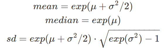
Assuming X is log-normally distributed, when the standard deviation of log(X) increases, while mean of log(X) remains the same (for following example, meanlog is 1), based on the above equations, the median of X remains the same, that is exp(1) (about 2.7). This value is reflected in the following cumulative density plot, where every curve intersects at the same median where probability accumulates to 50%. And when the standard deviation of log(X) is small, the density curve peaks at about 2.7, as the mean is very close to median. When the standard deviation of log(X) increases, the standard deviation of X increases. As a result, the density plot of X has a longer tail skewing towards higher X values. This is also captured by the cumulative probability density function that shows when the sigma of log(X) increases, 50% of the probability density (area under PDF curve) is achieved by extremely small values of X and the CDF grows extremely slow beyond the 50% of whole density. As the sigma of log(X) grows, the mean of X becomes bigger and more different from the median. The peak of X grows taller (to balance the tail for keeping median the same) and shifts towards 0 (but never on zero).
As for most of the distributions in R, there are dlnorm(x, meanlog=0, sdlog=1) (PDF), plnorm(x, meanlog=0, sdlog=1, lower.tail=TRUE) (CDF), qlnorm(p, meanlog=0, sdlog=1, lower.tail=TRUE) (quantile) and rlnorm(n, , meanlog=0, sdlog=1) (random sampling) functions.


#### Explore the PDF based on the same meanlog but different sdlogs ####
# define sdlogs
sdlogs=c(0.25,0.5,1,2,4,8,16,32,64)

# define x for fine gridding the density plot
x=seq(0,5,length.out=300)

# getting all density based on sdlogs with meanlogs=0
ds=tibble(x=x)
for(i in 1:length(sdlogs)){
  name=paste0("sd: ",sdlogs[i])
  print(name)
  ds=ds %>%
    dplyr::mutate(!!name:=dlnorm(x,meanlog=1,sdlog=sdlogs[i]))
}

# pivot longer, and set the order as it is so that sd is increasing
ds = pivot_longer(ds,cols=-c(x), values_to="density",names_to="type")
currentorder=unique(ds$type)
ds$type=factor(ds$type,levels =currentorder)

# plot densities
ggplot(data=ds)+
  geom_line(aes(x=x,y=density,color=type),size=1.3)+
  scale_x_continuous(limits=c(0,5),name="") +
  scale_y_continuous(name="Density")+
  theme(text=element_text(size=30),
        legend.position=c(0.8,0.7),
        legend.title=element_blank())

ggsave("./plots/log-normal_varied_sdlog.png")

# the more finely you chop the intervals you will get even higher density for x near 0 for bigger sd
ggplot()+
  geom_line(data=tibble(p=seq(0,5,length.out=300),d=dlnorm(p,meanlog=1,sdlog=64)),aes(x=p,y=d))+
  theme(text=element_text(size=30))

ggplot()+
  geom_line(data=tibble(p=seq(0,5,length.out=1000),d=dlnorm(p,meanlog=1,sdlog=64)),aes(x=p,y=d))+
  theme(text=element_text(size=30))

ggplot()+
  geom_line(data=tibble(p=seq(0,5,length.out=5000),d=dlnorm(p,meanlog=1,sdlog=64)),aes(x=p,y=d))+
  theme(text=element_text(size=30))

###CDF###
# getting all cumulative density based on sdlogs with meanlogs=0

cds=tibble(x=x)
for(i in 1:length(sdlogs)){
  name=paste0("sd: ",sdlogs[i])
  print(name)
  cds=cds %>%
    dplyr::mutate(!!name:=plnorm(x,meanlog=1,sdlog=sdlogs[i]))
}

# pivot longer, and set the order as it is so that sd is increasing
cds = pivot_longer(cds,cols=-c(x), values_to="cum_density",names_to="type")
currentorder=unique(cds$type)
cds$type=factor(cds$type,levels =currentorder)

# plot cumulative densities
ggplot(data=cds)+
  geom_line(aes(x=x,y=cum_density,color=type),size=1.3)+
  scale_x_continuous(limits=c(0,5),name="") +
  scale_y_continuous(name="Cumulative Density")+
  theme(text=element_text(size=30),
        legend.position=c(0.8,0.23),
        legend.title=element_blank())

ggsave("./plots/log-normal_varied_sdlog_CDF.png")
If a log-normal distribution is used as the likelihood function, the prior and posterior distributions are estimates of the location and scale which are the mean and standard deviation of the log-transformed data and having log-transformed units. Therefore, interpreting these parameters requires transforming sampled parameters by the exp() function. For the prior and posterior predictive distributions (here you are sampling predictions other than parameters), if drawn by custom functions, sampling from the log-normal distribution (rlnorm()) is recommended. If data was sampled from a normal distribution (rnorm()) instead, then use exp() function to transform them as you have essentially sampled from a log-transformed data set. If sampling these predictive distributions were achieved by one of the brms functions, the predictions assemble original data and have the same unit (e.g. posterior_predict(), pp_check()).
If we have a dependent variable that follows the log-normal distribution and is affected by other independent variables, we can assume a linear relationship between the location of the log-normal distribution, which is also the mean of the log-transformed distribution, and the effects from these independent variables.
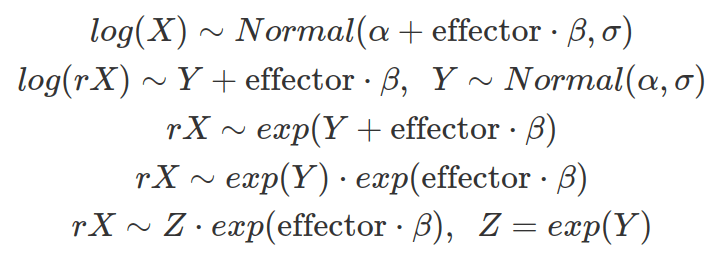
As shown above, Z follows the log-normal distribution, representing the part of X that is not affected by the effector and maintaining the same location. Therefore, the effect from an independent variable to the location of a log-normal distribution is multiplicative rather than additive and grows or decays exponentially. Besides, the influence from the independent variable is not only determined by beta but also by the location of the data (or the mean of the log-transformed data).
Sometimes the exponential growth (beta>0) or decay (beta<0) does not make sense as it makes an extremely big or small value possible for the dependent variable. To introduce ceiling or floor values, use logged independent variables to fit the model.
The log-normal distribution is common in scientific data, as many measurements are skewed with long tails. Besides, many influences exerted by other factors are multiplicative to a normally distributed variable rather than additive, showing a synergistic effect.
